Concept Project · Mobile App · Premium Fashion
Hide Clothing
Hide is an established premium fashion brand. This project is a concept mobile app created as a pitch piece, exploring how Hide’s existing identity and visual language could translate into a mobile-first shopping experience.
The goal was not to redesign the brand, but to interpret it consistently within a product interface — focusing on clear navigation, image-led browsing and a streamlined path to purchase.
- Concept
- Mobile UX/UI
- E-commerce
- Design System

Note: This is an independent concept project inspired by Hide’s existing website and brand presence.
The Challenge
Premium fashion brands rely heavily on tone, typography, whitespace and imagery to create a distinct identity. The challenge was translating that expression into a mobile experience that still feels premium while improving usability for smaller screens — particularly around browsing, product evaluation and purchase.
The concept focused on reducing friction and decision fatigue by simplifying navigation, prioritising imagery and designing a consistent set of patterns that could scale across collections and seasonal releases.
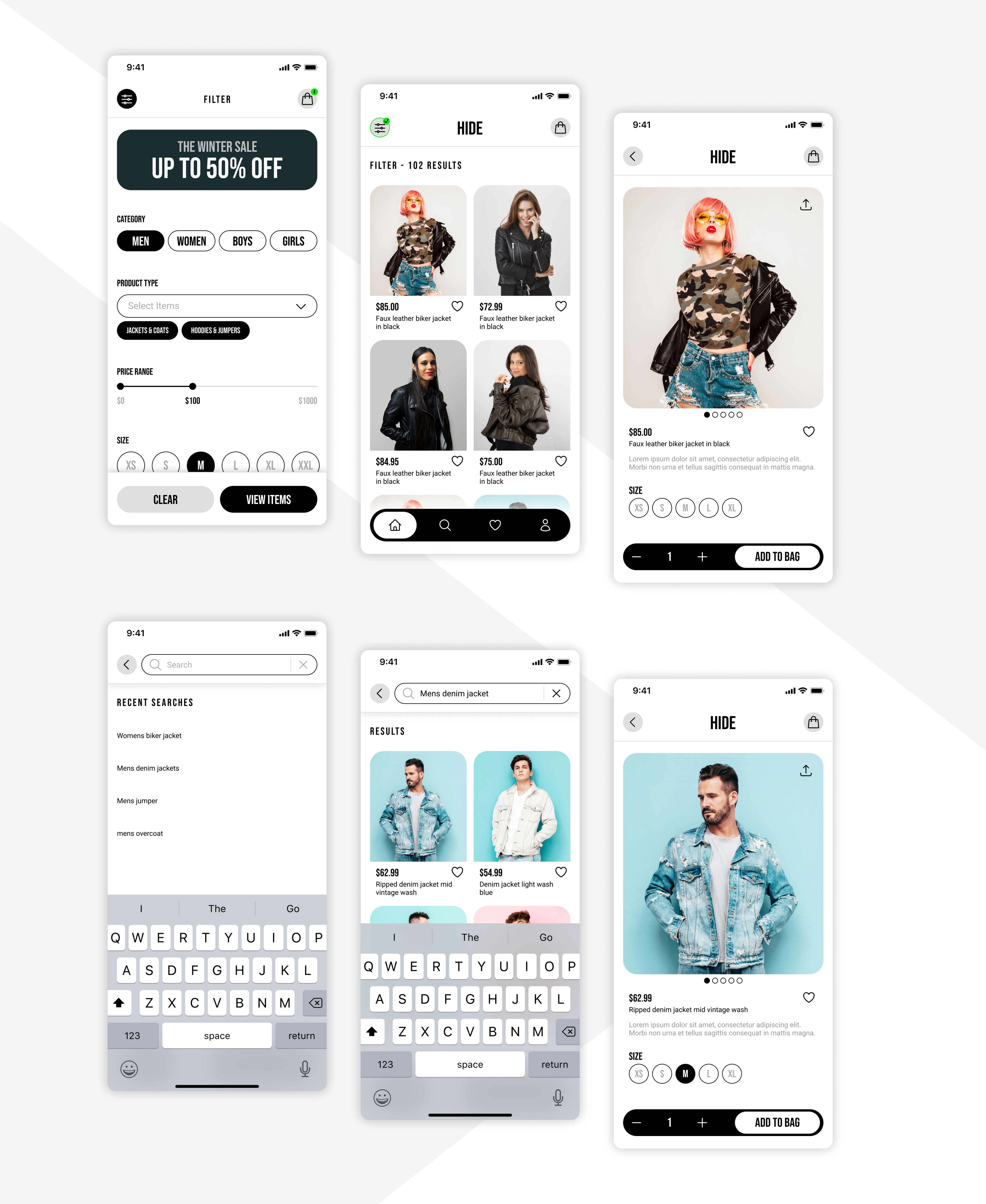
Discovery & Navigation
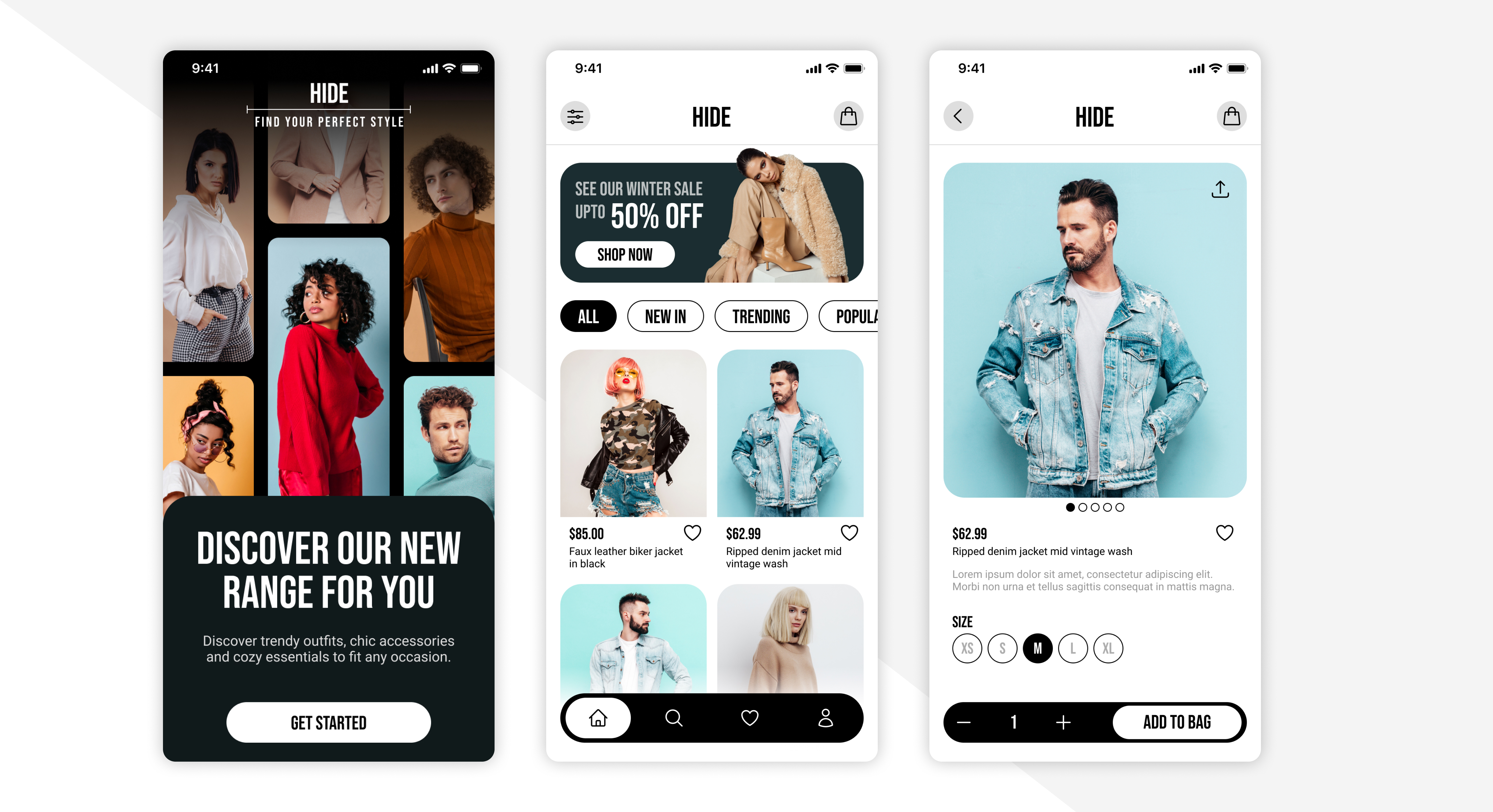
The navigation system was designed to make movement between collections effortless without losing context. The experience supports quick scanning on mobile while preserving Hide’s minimalist tone.
- Simple and predictable category structure
- Image-first layouts to maintain brand identity
- Clear hierarchy supporting fast mobile scanning
Product Experience
The product page balances editorial presentation with practical decision-making. Critical information is surfaced clearly while maintaining a calm and refined reading experience on mobile.
- Strong hierarchy for primary decisions such as size selection and add to bag
- Structured content blocks for product details and care information
- Consistent spacing and typography to preserve brand tone
Bag & Checkout
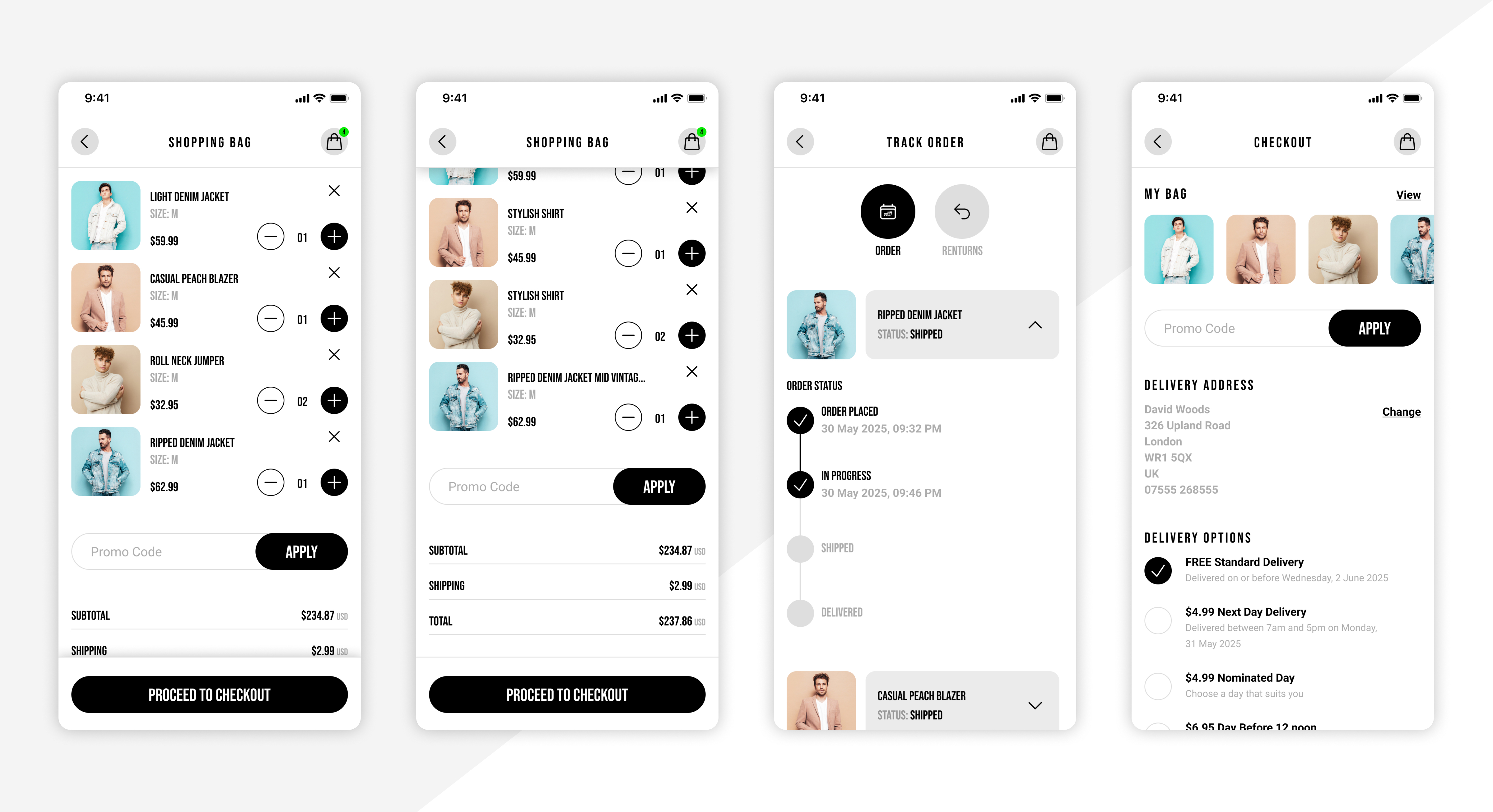
The purchase flow was designed to feel simple and confidence-building. It supports quick review, clear pricing and a predictable path to completion without compromising the premium aesthetic.
- Clear item summaries and transparent totals
- Predictable primary actions and progression
- Structured to scale as promotions or bundles evolve
UI Foundations
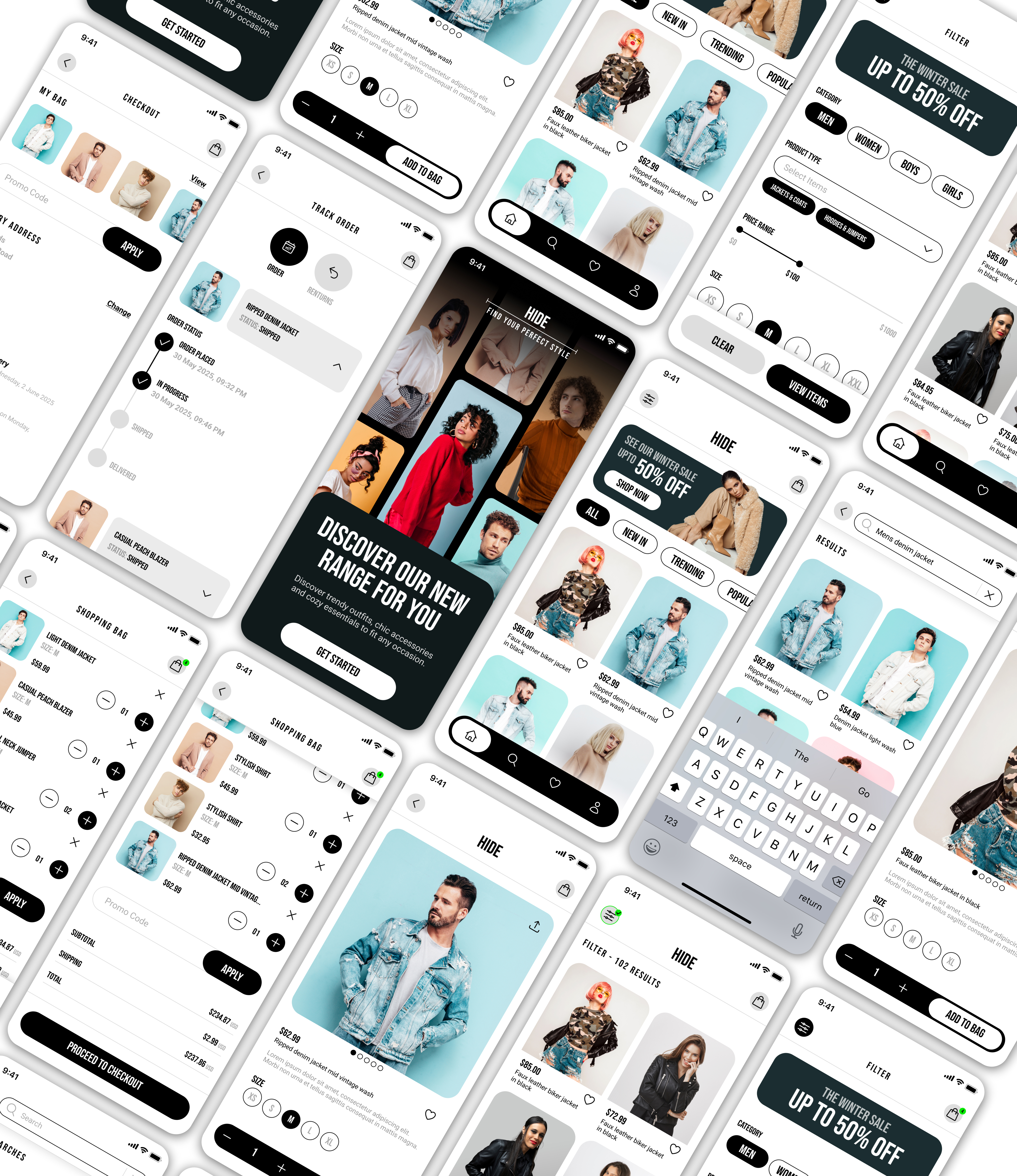
Even as a concept, the work was approached as a scalable product system. Establishing strong foundations ensures consistency across collections, account states and potential future features such as wishlists or order tracking.
- Defined colour roles and contrast to support readability
- Reusable components and spacing rules
- Consistent interaction patterns across the app
Result
A mobile-first app concept translating Hide’s premium brand into a clear, image-led shopping experience.
The design balances editorial expression with usability, supporting discovery, product evaluation and purchase through scalable UI foundations that could extend into a fully realised product.